 Here at BUX Advisors (see note 1) we are always looking for great examples of banking user experience. But we’ll also take horrible ones too, since they make for good blog material.
We found a little of both in our recent look at how the ten largest U.S. banks served shoppers for Individual Retirement Accounts, more often called IRAs. It’s a tax-deferred savings vehicle established in 1974.
According to the most recent info from the GAO (2011 tax year), 43 million American households (note 2) held $5.2 trillion in tax-deferred retirement accounts (includes rollovers from 401k plans), for an average of more than $100,000 per taxpayer.
Clearly, this is a major source of savings in the United States, but if you visit the typical bank website, you’d hardly know IRAs existed. Even during this key time of year where Americans can still make IRA deposits to deduct on their previous year’s tax returns, only two of the largest 10 banks, US Bank and Wells Fargo (see below) had a homepage promo of IRAs (or more general retirement savings). And Wells was not subtle at all with up to three messages, plus the primary navigation, visible above the fold.

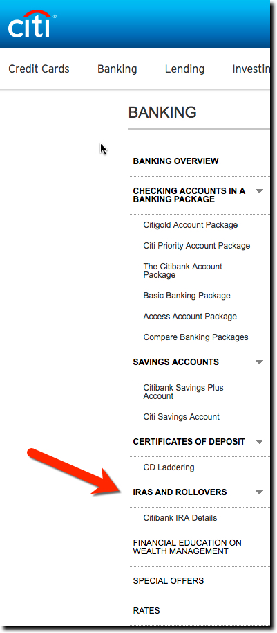 Instead of homepage promos, most banks required users to scroll through secondary navigation menus to locate the IRA page. The banks did better here, with 8 out of 10 listing Retirement Accounts on the secondary navigation. Only Chase and US Bank had no navigation guidance. However, only one Citibank, used the term IRA in navigation (see inset).
For most banks, it was easier to find the right page through site search. Nine out of 10 did a good job of displaying pertinent results at the top of the search results. Only Capital One failed this simple test.
The banks also did a great job explaining the different types of IRAs and who qualifies. All 10 passed this test. And 8 of 10 answered basic questions in an FAQ or articles on retirement savings. And all but Citibank had a retirement calculator. But when it came to disclosing prices and fees, only 3 were upfront on that: Bank of America, Wells Fargo, and TD Bank. And not a single bank linked customers to outside sources of information on this important topic.
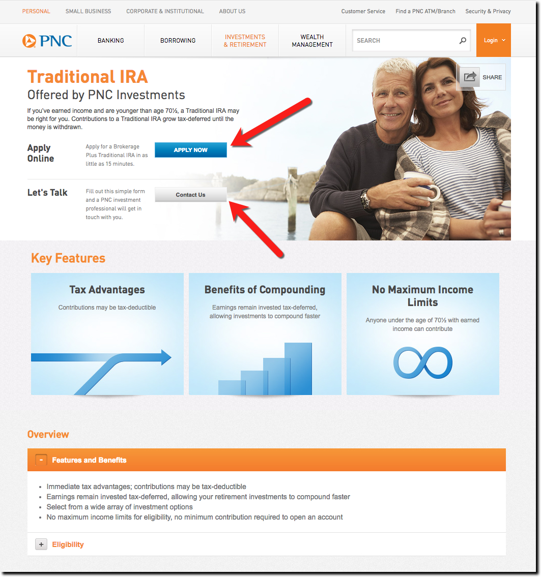
In terms of design, most IRA sections were straightforward and relatively plain. That’s OK, banking shoppers aren’t looking for a 360-view of the account. But we did have a favorite, PNC Bank, the only bank which looked to add a bit of panache to the IRA landing page (see below).
Finally, we are technologists, so it’s hard to for us to understand why anyone would fail to have an online application in 2017. But when it comes to IRAs, half the banks did not offer this minimum requirement.
Overall results:
We rated the banks from 1 to 5 on each of our 10 IRA Shopping UX guidelines (aka best practices). We consider anyone scoring 60% or more to be acceptable, and 80% or more to be exceptional.
Four banks made it over the 60% hurdle, with the winner, Wells Fargo, making it past 80%. Here are the top four:
- Wells Fargo >>> 81%
- PNC Bank >>> 73%
- Bank of America >>> 67%
- US Bank >>> 64%
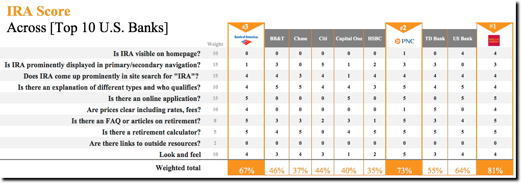
Source: BankingUX.com, Jan 2017
Notes:
- BUX Advisors is an independent consultancy which analyzes financial websites for usability, design, and overall user experience. Contact us if you’d like to participate in our 2017 digital banking benchmarking study.
- Technically, the IRS number quoted in the GAO report is “taxpaying units” which includes couples filing jointly, individuals, and couples filing separately. But since only 5% of married couples file separately, the 43 million number is a good proxy of households, although it probably overstates it by a couple percent.


