NextCard homepage circa 1999
After years of look-alike websites from the major U.S. banks, we are seeing a divergence of layout approaches. Why the new found creativity? Besides (much) bigger budgets, much of credit (or blame depending on your outlook) is the new UI religion, responsive design, the art and science of making your website work on mobile as well as desktop.
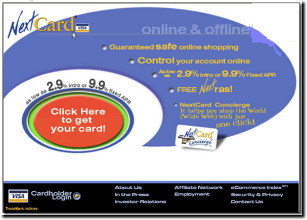
Overall, we think the responsive “less is more” philosophy is a good thing. For 20 years, we’ve advocated a 25-word homepage. But other than NextCard (inset) and X.com, no financial institutions followed this mantra until responsive sites began to crop up 3 or 4 years ago. Now it’s relatively common for the “above the fold” portion of the site to contain just a tiny amount of copy.
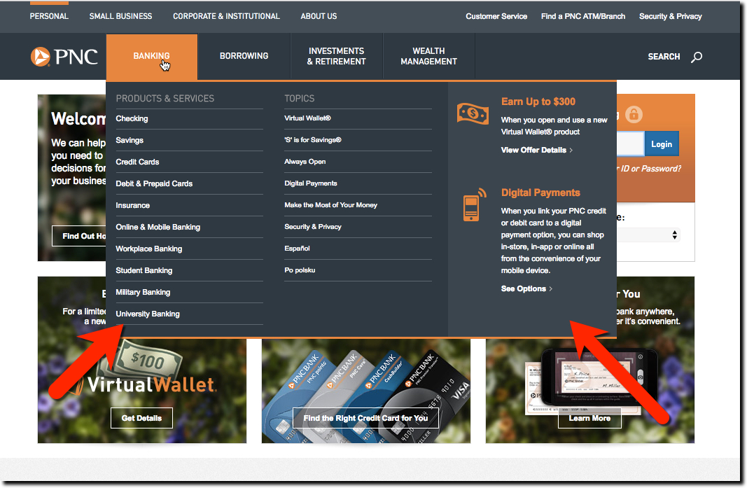
But what about those navigation bars with ever-expanding foldout menus? That’s where much of the copy and links that used to litter the homepage are hiding. Case in point: PNC Bank, which has done pioneering work in digital (ie. PNC Virtual Wallet) has 194 choices available in its homepage navigation (see screenshot below). While the bank divides the links into three market segments (personal = 73 links in 4 categories, small business = 64 links in 4 categories, and corporate = 57 links in 5 categories), it’s still an overwhelming experience to navigate the navigation. And, to make matters worse, I could barely read the choices (using Chrome on 13-inch Air) because of the small white font.
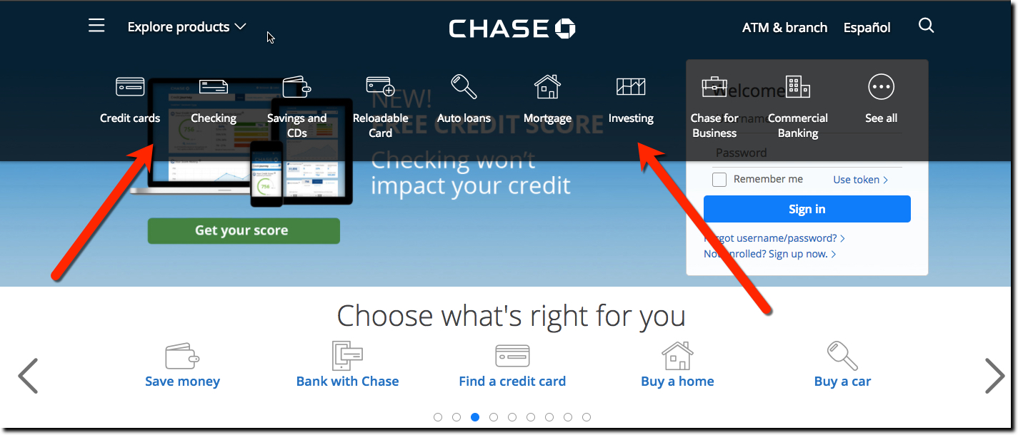
Compare that with Chase. While initially they went overboard simplifying its home page, making it essentially a huge login button, I like where they ended up. Chase’s primary navigation is tucked away under the “Explore products” link in the top-left corner. Clicking it launches a short horizontal list with just 9 items (see screenshot below). After selecting one, you are sent to a landing page designed for visitors interested in those products. You can also select “See all” on the far right that goes to an old-school site map. My only complaint on this implementation, is that the primary navigation items are a bit hard to read as white font over a partially dimmed background. We recommend increasing the contrast for better visibility.
Recommendation: There is no right answer when it comes to navigation design.
Large banks have many, many large business segments, and there needs to be a way to expose the choices to visitors. Site search is one powerful way to do that, and most FIs could do much better in funneling users into search and then onwards to the correct product area. But many users prefer standard navigation to get started, so you can’t ignore that. But we urge you to avoid dropping 194 choices on your visitors. Ideally, you want to get visitors engaged during the first 30 seconds. Overwhelming them with choices, no matter how clever your TM names, is a surefire way to lose them.


