I have long been inspired by USAA’s innovation, mission, and execution. And have not written a negative word about them in 20+ years of covering the digital banking space. But like all streaks, it had to end some time. And today was that day.
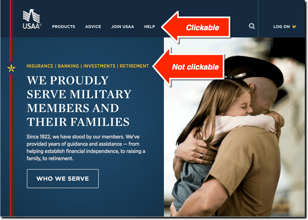
This morning I typed “USAA” into my browser to take a quick visit looking for more inspiration and noticed the surprising user experience faux pas. The site is currently using a bold, simple and copy-light design which I highly support. But a crucial step for user engagement is mis-designed.
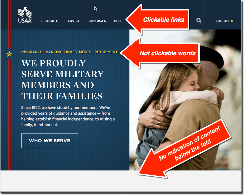
The four product names listed above the main graphic: Insurance | Banking | Investments | Retirement, are not clickable despite using a different font treatment indicating they are links (see screenshot above). On 99% of websites, these items would be clickable. Instead the bank expects users to click on the less-visible primary navigation at the top or scroll down the page.
 But that leads to another minor design flaw. Because the page directly below the fold leads with pure white space, it’s not obvious to users with smaller laptops that there is more content below the fold (see note 2).
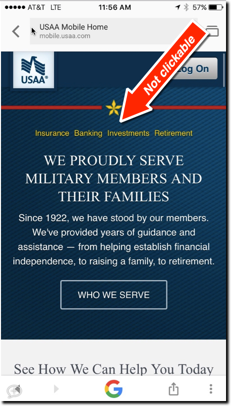
The responsive-designed page has an even worse UX on a smartphone (iOS). The top navigation disappears and users must scroll down 6 or 7 screens before there are clickable navigation links (see inset). It definitely needs an overhaul.
Bottom line: Most motivated visitors will have little problem finding the clickable buttons. But if they are like me, they will first click several times on the non-clickable line thinking something is broken. This is not a good first impression.
Notes:
- Mobile experience viewed on iPhone 6 with latest iOS.
- Desktop experience viewed on 13-inch Mac Air running Chrome at normal font size.
- If you want to avoid making these mistakes, talk to us about a custom evaluation of your UI/UX.


