 During the past 4 or 5 years, there has been dramatic improvement in banking websites as the responsive design movement has taken hold. Websites are much cleaner, far less cluttered, and more aesthetically pleasing.
A big part the decluttering has been achieved by hiding the navigation items that used to be scattered all over the page. But no line of business wants to give up their homepage visibility. That has led to out-of-control menus, some with nearly 200 choices (across four popups).
Despite its flaws, the so-called mega-menu has become a well-regarded navigational approach (though not everyone thinks so). But we can agree that they are not going away anytime soon. So let’s see how we can make them more user friendly. Here are three tips to improve usability:
1. Delay the popup
The user doesn’t always want to see your fancy menu, they may want to direct to your promotion and hit the “open account” button. So make sure your menu doesn’t inadvertently stop them on their way to their chosen task. According to Nielsen Nelson Group, the mouse should hover for 0.5 seconds before triggering the popup.
2. Provide an easy way out
The menu pops up automatically as the mouse moves over the primary navigation item such as Personal or Business. And it doesn’t disappear until your mouse finds some clear website real estate that’s not part of the mega-menu. But depending on the size of your screen, the mega menu may take up most of the space so it can be hard to find the right place to rest your cursor and get the menu to go away. We like the simple solution used by Silicon Valley Bank. They have an X in the upper corner of the menu, the universally known symbol for “closing” a window (see screenshot below).

3. Make it scannable
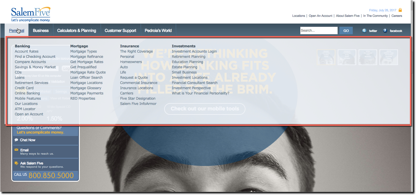
Think of your mega-menu as an outline of your website. Just like you learned in college, good outlines have headings, variable fonts, lines, bullets, color and a well-thought out hierarchy. And don’t forget to use a readable font size. Salem Five, which had the top-rated website design in The Financial Brand’s review a few years ago still has a gorgeous website. But its mega-menu is practically unreadable because of the small, gray font combined with a translucent bluish background (see screenshot below).
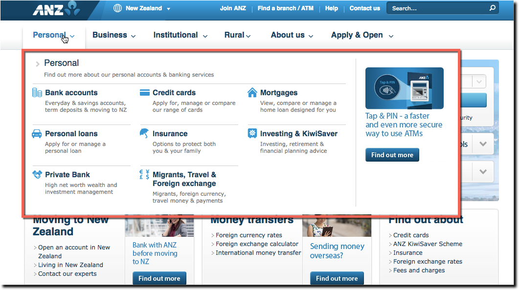
On the other hand ANZ Bank New Zealand integrated several graphics within its mega-menu (see screenshot below). It would probably be easier to read without the icons. Even so, look how much easier it is to find Credit Cards compared to the Salem Five menu above. As an extra bonus, the menu is uncluttered enough that the bank can add a promotion to the upper right without over-cluttering the menu.


